Brand positioning to inform a responsive
marketing website

How to convince customers you’re different in a crowded market.

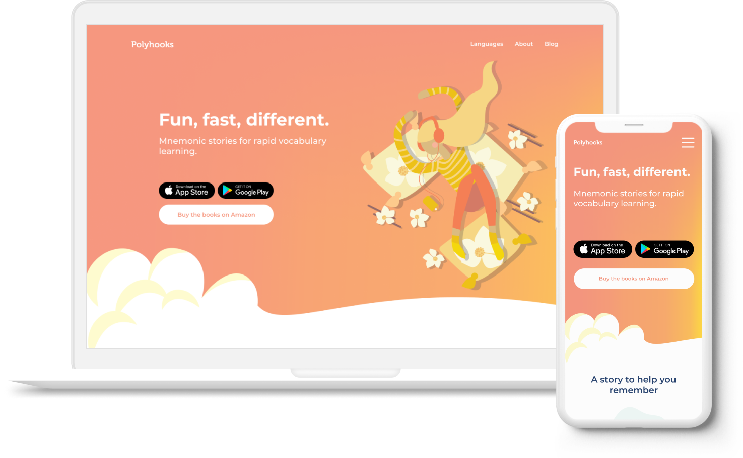
A fresh and engergetic brand for a new take on language learning.

See it on mobile >>

Background

BUILDING A DIGITAL IDENTITY

Polyhooks is a new company offering a novel way to learn foreign language vocabulary. It uses mnemonic stories to help learners connect with and remember vocabulary words.

Polyhooks was releasing an illustrated book series in multiple languages and planning to build an app.  They needed cohesive branding and a responsive website to market their products.

This case study explains how I developed the Polyhooks digital branding and designed their responsive marketing page.

MY ROLE
I owned the entire UX process from ideation to delivery.  
TIMELINE
2 weeks
TEAM
Founder (Product)
App developer
Me ✌

Key Deliverables

BRANDING & WEBSITE
01
RESPONSIVE LANDING PAGE
The main goal was to establish a website to promote the product and bring the business online.
02
BRAND POSITIONING
The marketing page content would consist of Polyhooks brand messaging and key value props; we neeeded clearly to define what those were.
03
COHESIVE VISUAL BRANDING
Polyhooks had a logo and style in the books, but they did not yet have defined, cohesive branding. I needed to create a digital brand that cooperated with the illustrations and tone of the printed product.

Research

COMPETITOR ANALYSIS

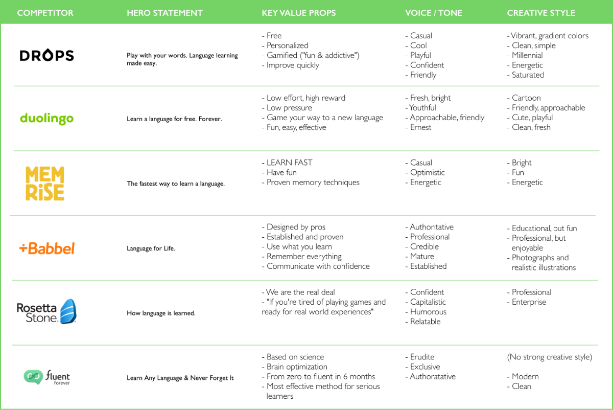
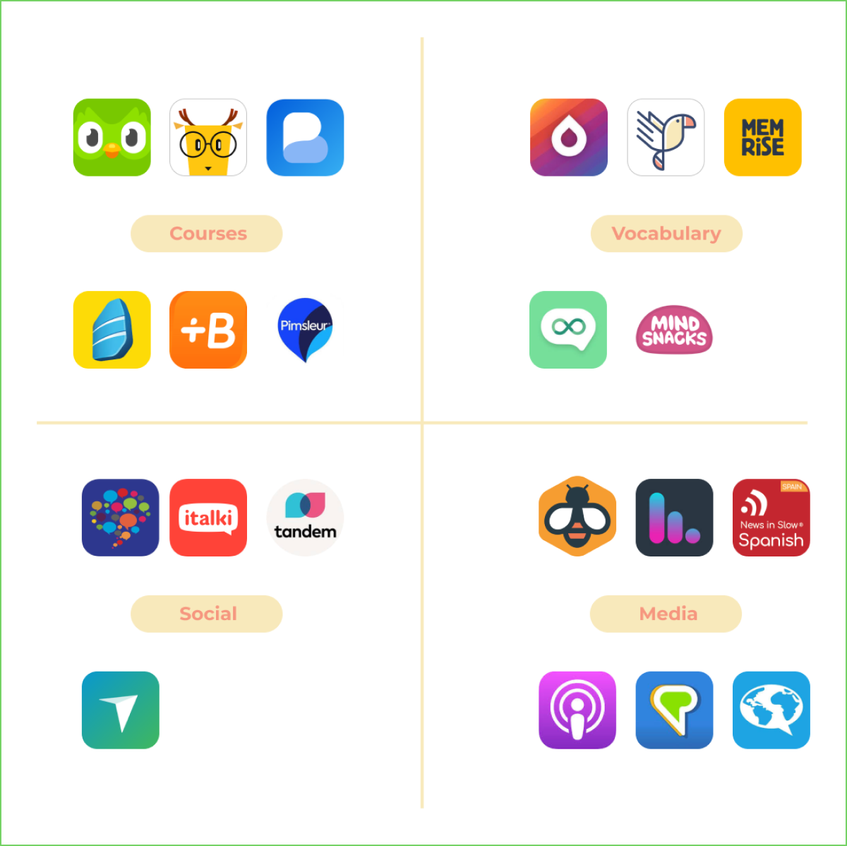
I analyzed the marketing platforms of some of the biggest language apps out there.

KEY TAKEAWAYS:
  • Serious vs. Casual: There was a split between emphasis on serious professional goals and gamified fun learning.
  • Key value props:
Free
Fun
Easy
Fast
Proven
Personalized
  • Product types: I also classified competitors by the type of content they offered and identified four main types:

    Courses:
    Traditional, sequential programs

    Vocab:
    Focused on the words

    Social:
    Engaging other speakers

    Media:
    Podcasts, news, literature
Polyhooks fell solidly in the vocab group. While we would offer basic grammer and cultural insights, our primary service was vocabulary building.
USER INTERVIEWS

As an American living in Brazil, I had a very compelling reason to learn Portuguese. My study efforts now look very different from when I flirted with Duolingo to try to keep up my Spanish.

I wanted to talk to a broad spectrum of learners to understand their motivations, habits, and challenges. After listening to the experiences of 7 people, here’s what I learned:

PARTICIPANTS
7 participants
Ages: 23 - 34
Languages: Japanese, Korean, Arabic, Spanish, French, German, Italian
MOTIVATIONS
  • Cultural interest: Heritage or media exposure
  • Travel: Work or pleasure
  • Relationships: Romantic or friends are also learning
  • Global connection: “I feel like I should know more than one language.”
GOALS
  • Functional communication: Being able to communicate and understand people was more important to beginning learners than getting it perfect.
  • Not many people focused on fluency. Learners explained that the kind of commitment and effort required to reach fluency was probably unrealistic.
CHOOSING A PROGRAM
  • Social proof: “It was the one my friend used and also seemed to be the one everyone was using.”
  • Ease of access: “I used Rosetta Stone because it was offered by my company for free. I also chose Duolingo because it was free, and also because it’s an app so it was super easy for me to pick up and use anywhere.”
PAIN POINTS
  • Staying disciplined: Like any other long-term goal, users had trouble staying disciplined. Users who had a reason to use language socially were more likely to stick with it.
  • Boring and repetitive: Depending on the program, many users described learning language alone as boring. Users who attended study groups or tutoring sessions stuck with it longer.
OPPORTUNITIES TO ADD VALUE
  • Polyhooks puts an end to rote memorization. With mnemonics, repeat less and remember more.
  • Polyhooks includes cultural content. We understand that language is a social, contextual skill.
  • Polyhooks is for beginners. Rather than fluency, our goal is getting you the words you need to have the confidence to communicate.
USER PERSONAS

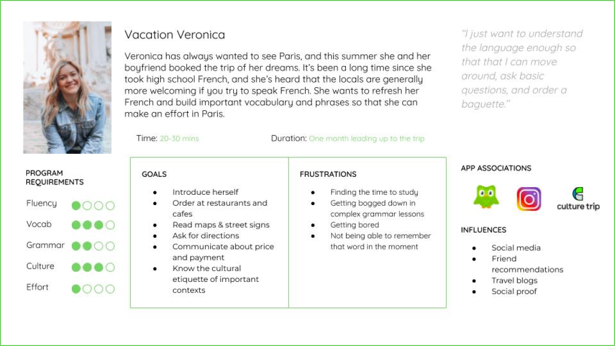
Based on the research I recognized several user personas.

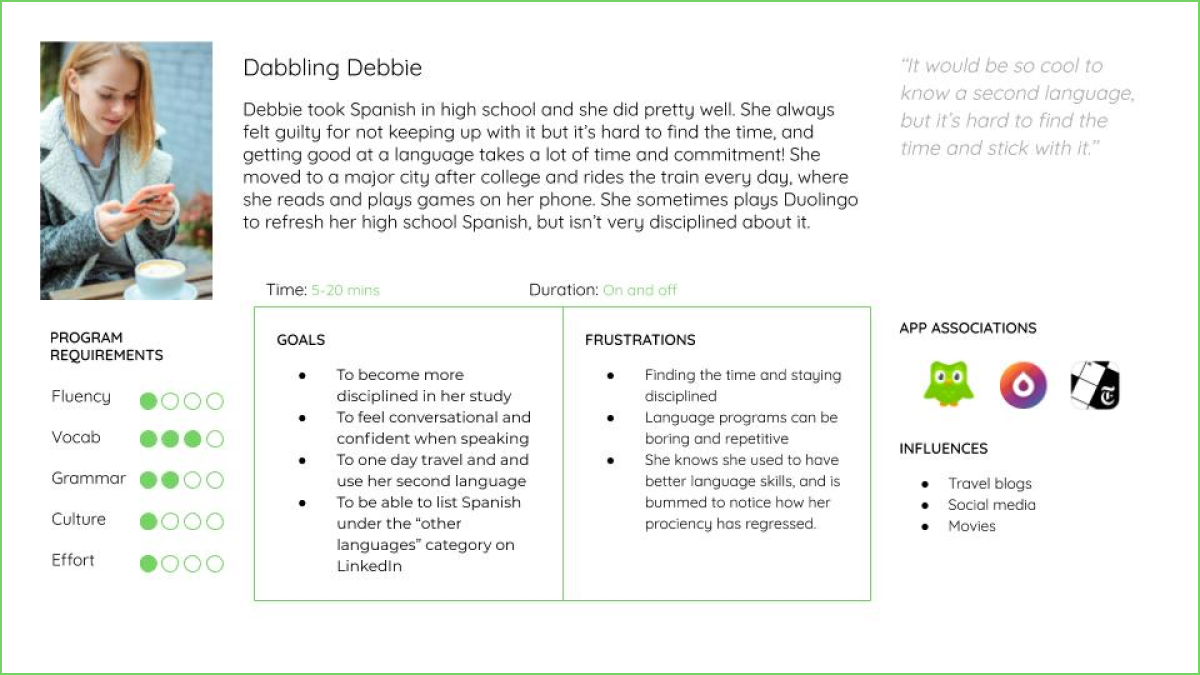
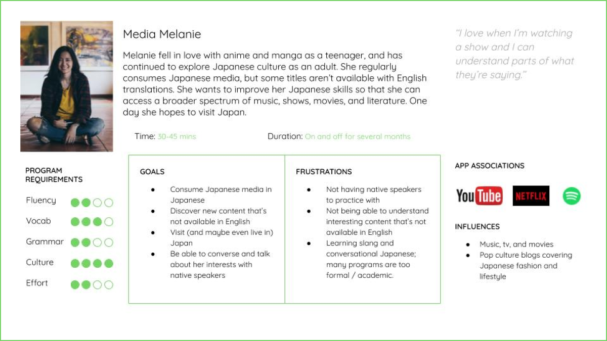
Since Polyhooks was a beginner program offering fun, easy, vocabulary building, I focused on personas that valued higher vocab and cultural learning goals, with lower fluency and grammar goals:

  • Vacationing travelers
  • Dabbling studiers
  • Media consumers

Branding

IDENTITY & POSITIONING

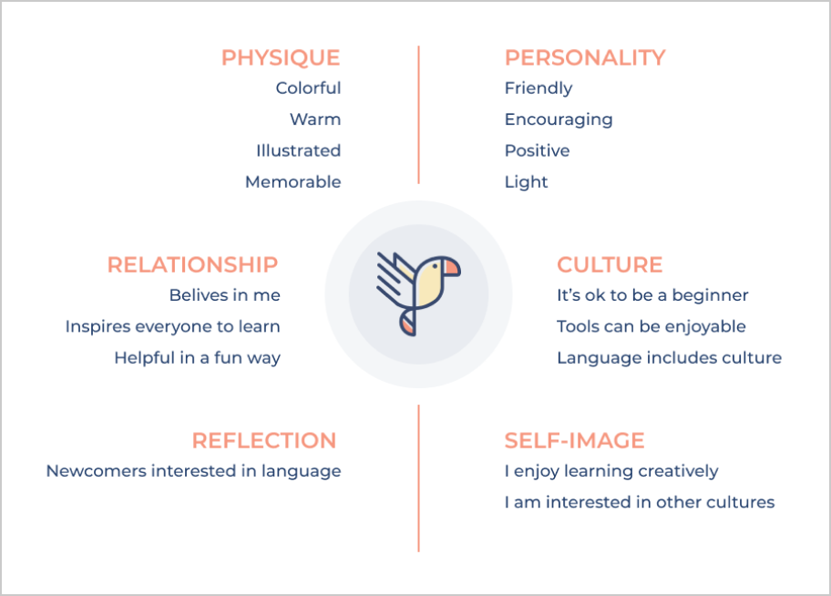
After interviewing the founder I synthesized a framework for the Polyhooks brand. I focused on defining users, problem, and solution:

01
WHO DOES POLYHOOKS SERVE?
  • Beginning language learners
02
WHAT PROBLEM DO OUR USERS FACE?
  • Beginners lack the vocabulary to produce satisfactory language
  • Vocabulary memorization is repetitive and boring
03
HOW DOES POLYHOOKS SOLVE THIS PROBLEM?
  • A story-based mnemonic device that makes word memorization easy
  • Lighthearted, colorful content that entertains and delights
04
WHAT IS POLYHOOKS’ UNDERLYING BELIEF?
  • Growing vocabulary early leads to faster language production
  • With the right strategy memorization can be easy and rewarding
THE POLYHOOKS BOOK

A major part of my product research was diving into the Polyhooks book.

I read the book with the goal of building my knowledge of the Polyhooks product and gathering datapoints around its personality and brand identity.

The book was so fun to read! Its friendly, goofy tone gave me the feeling that a friend was tutoring me on a Sunday afternoon.
WHAT IS POLYHOOKS:
  • Vocabulary words: Polyhooks is primarily focused on buidling vocabulary.
  • Mnemonic memorization: This is our key differentiator.  Polyhooks uses stories to help people memorize words.
  • Color & imagery: Polyhooks uses imagery to inspire an emotional response from learners.
  • Conversational & accessible: Polyhooks is a friendly starting place for anyone wanting to learn a new language.
I used this research to construct a brand identity prism
BRANDING & UI KIT

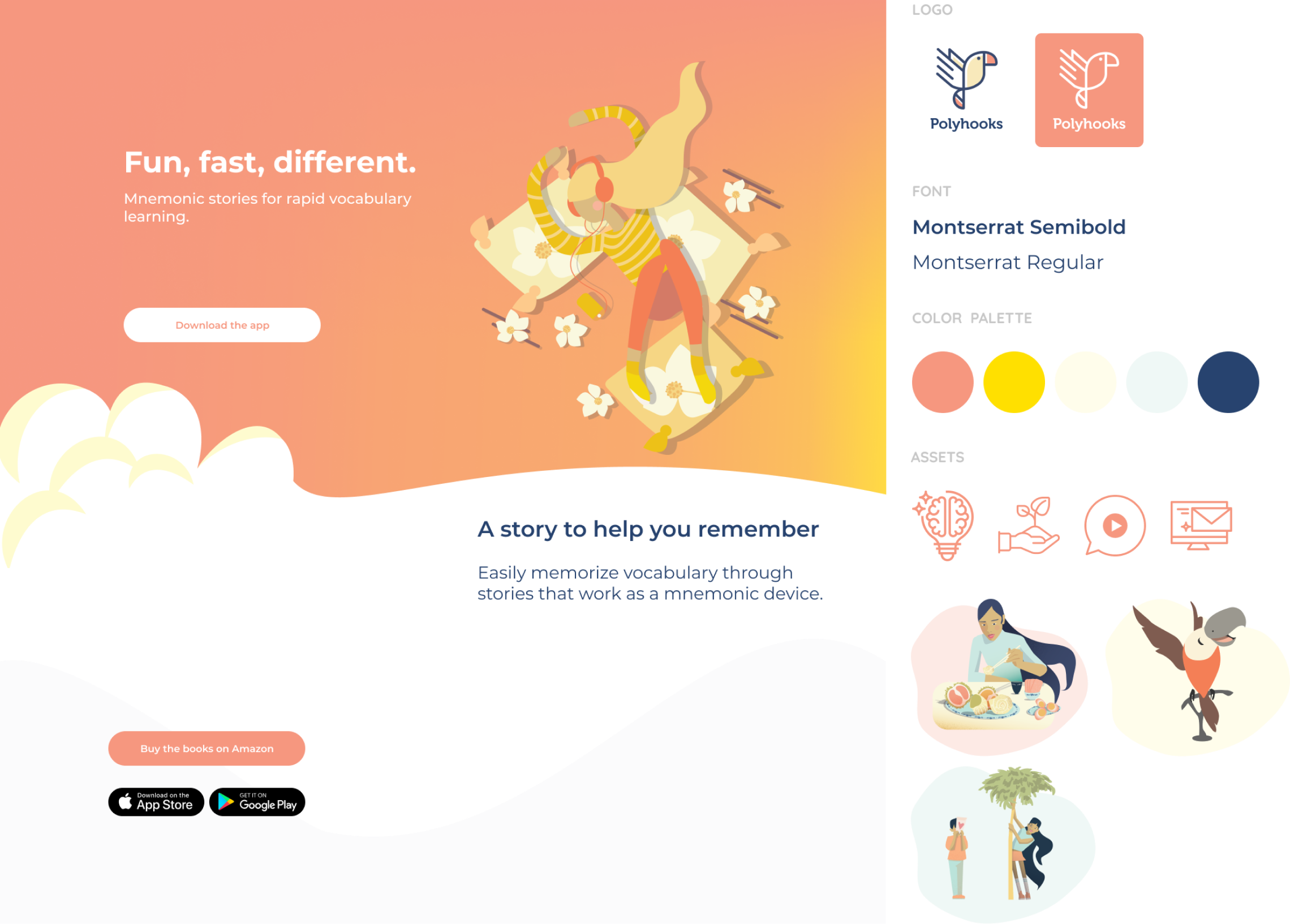
I anchored the visual branding around the printed book, which had illustrations and lots of color (the book file I received had over 100 different colors!).

I wanted to capture the friendly, warm tone in the book, but also brighten some of the colors to create an exciting first impression.

The book used washed out colors that felt a little muted. I created a palette that could complement the book and brighten the brand.

Ideation

SKETCHING

The business goals for the website were straightforward:

  • Explain the product
  • Promote app downloads
  • Sell the book

In addition to clearly highlighting the value props, I wanted users to be able to see themselves in the pain points.

“Fun, fast, different” took a while to get to. The founder really liked “Truly rapid vocab acquisition,” but this didn’t resonate in user testing. I pushed us to include “different” because we needed to adjust user expectations around how language programs work.
A MNEMONIC DEVICE?

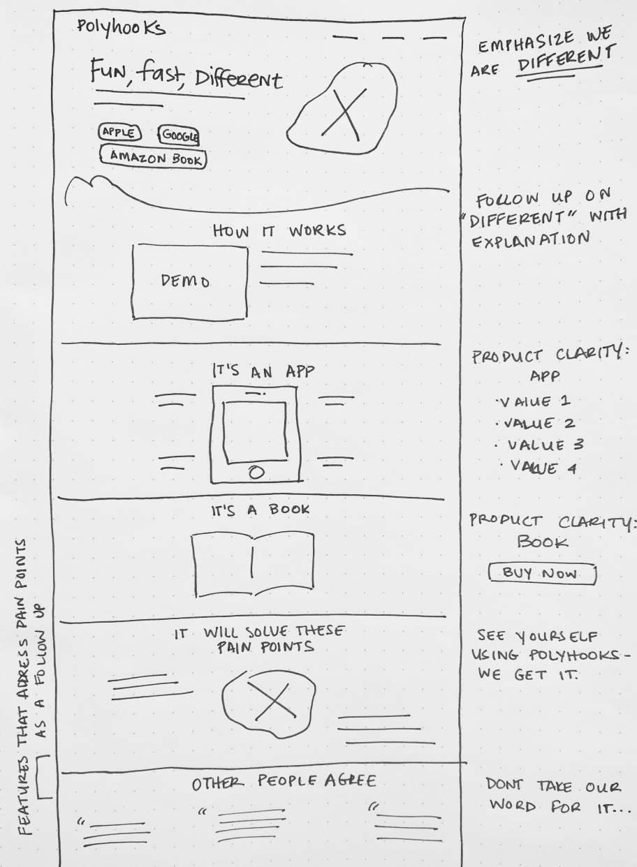
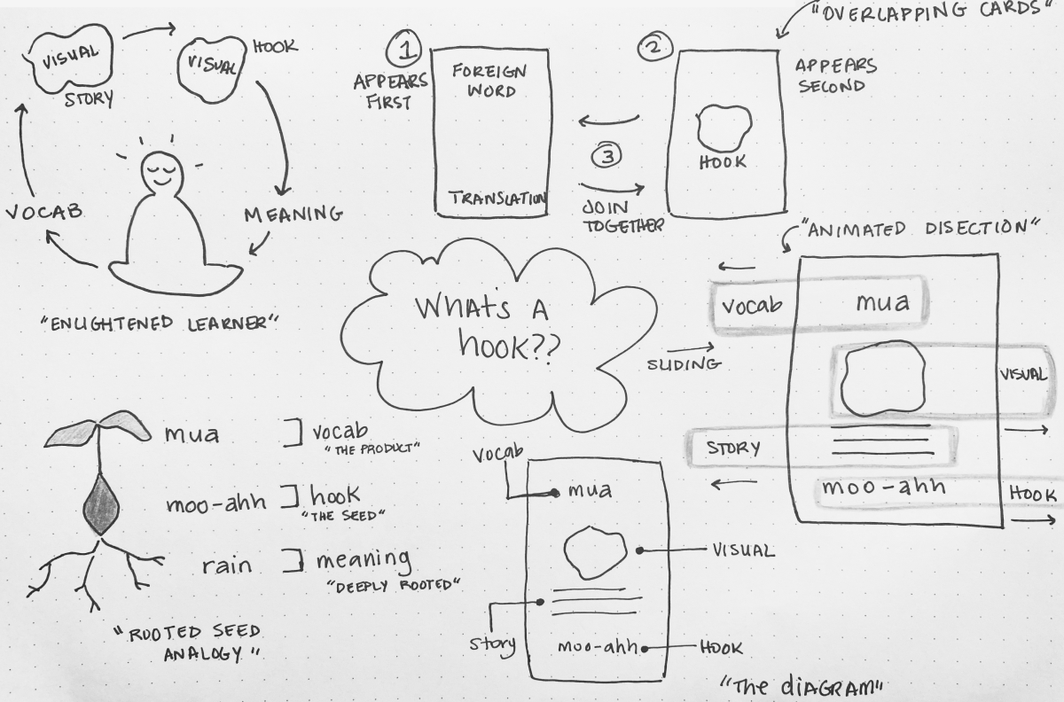
The tricky part was going to be succinctly explaining the Polyhooks method.

We didn’t look like anything else out there. Other than “mnemonic device” we didn’t yet have clear language to describe the “how” of what we do.

I brainstormed like there was no tomorrow. I talked to friends, neighbors, my hairdresser, my dog . . .

This is a sample of some of the ways I tried to visually explain the concept of a memory hook. It drove me nuts for the better part of a week.

Designs

A STORY-BASED SOLUTION

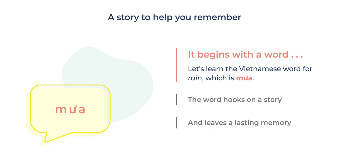
After lots of brainstorming and many long showers I arrived at a solution. If Polyhooks used stories to teach vocabulary, why not use storytelling to explain our method?

I developed a scene sequence to illustrate the link between vocab, hook, and definition. I wanted the sequence to feel connected, like the word–hook relationship, but a rotating carousel made the sequence feel like separate steps. 🤔

My solution was to advance the visual story alongside animated text to create a feeling of togetherness through synchronized motion.

FINAL DESIGNS

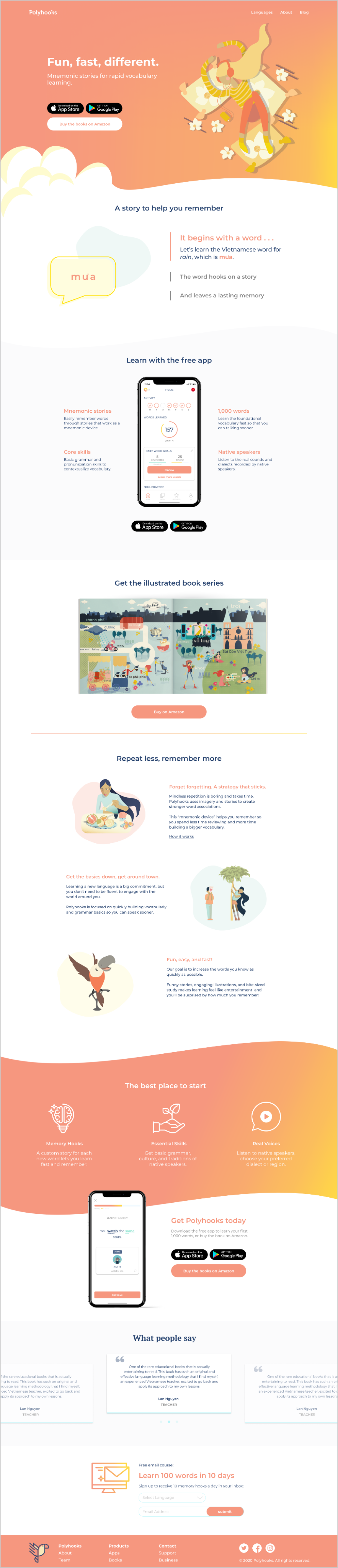
Bringing together the research and branding work, I developed value props, copy, and designs for the website.

We wanted to encourage app downloads as the lowest barrier to entry.
I focused on the value props that tied to the goals and pain points uncovered in user interviews.
We had a business goal to include a place where prospective learners could sign up for an email course. I’d like to test alternative placements of this form to optimize engagement.

Reflection & next steps

WHAT I LEARNED

Working with a passionate founder who had thought so deeply about the product and vision was a really cool experience. It’s rare to have access to so much knowledge in one place.

At the same time, coming in as a designer proposing change was a delicate undertaking. I think my biggest takeaway was that it’s sometimes more effective to demo new ideas than to verbally try to get buy in. Early inclusion of key stakeholders is core to my belief as a designer, and learning when and how to do this well is a skill I work to refine every day.

NEXT STEPS
01
GOOGLE ANALYTICS
  • I’m looking forward to learning more about user engagement across platforms and identify opportunities for improvement.
02
COPY A/B TESTS
  • I wrote several versions of the marketing copy around value props and pain points. I’d love to run a few A/B tests to learn which versions resonate with people most.