How to turn a vocabulary book into a
mobile learning app

We had a language learning book that was starting to sell.

How might we build an app that could serve as a resource for book users and also translate the book’s learning method into a digital learning experience?

Check out the prototype >>

Background

IT’S A BOOK... IT’S AN APP... IT’S A METHOD

Polyhooks is a tiny company publishing a series of books with a unique way of learning foreign language vocabulary. It's based on the idea that you can quickly learn a bunch of words when they’re tied to memorable stories.

Initially, the idea was to create a simple companion app to teach readers how to pronounce the words they were learning in the books.

This evolved into “Hey, why not make this word-learning strategy into a digital tool that can provide a more engaging learning experience?”. This is where I came in, joining the team as the UX designer for the app.

MY ROLE
I owned the entire UX process from ideation to delivery.
TIMELINE
3 weeks to design the mobile app for Android/iOS
TEAM
Founder (Product)
App developer
Me 👋

What does success look like?

HIGH LEVEL GOALS
01
SUPPORT BOTH BOOK & DIGITAL USERS
How might we build a standalone digital learning experience while simultaneously providing a way for book users to access reference materials.
02
LET USERS CUSTOMIZE THEIR LEARNING
Everyone learns differently, and we wanted to offer basic program customizations that could personalize the learning experience.
03
MOTIVATE & MEASURE
How might we show users their learning gains and motivate them to study daily? How would we measure success and progress?

Who are our users?

PROVISIONAL PERSONAS

Since our app would provide two distinct services, I started by considering the needs and goals of our two general user types:

THE BOOK USER

How did they get here?
They were prompted to download the "companion app" when reading the book.
Product knowledge
The user is familiar with Polyhooks' method and might already have studied some Polyhooks content.
User goals
Enhance book learning with a companion app.
User needs
- Continuity with the book
- Easily access book materials
- Easily adopt the app as their primary study tool
First actions
1.  Register book
2.  Access book resources

THE DIGITAL USER

How did they get here?
They downloaded the app to learn a new language. (Word of mouth, organic discovery)
Product knowledge
We assume they know nothing. They might make assumptions based on other language apps that we’ll need to clarify.
User goals
Learn a new language and see if this app can work for me.
User needs
- Easily start learning
- Quickly understand Polyhooks' method
- Immediate sense of learning success
First actions
1.  Explore
2.  Enter core learning flow

Understanding & defining the product

CONTENT INVENTORY

Unlike linear language learning programs like Rosetta Stone or Babbel, Polyhooks is a strategy for memorizing words. The app would feature 2,000 Vietnamese words and corresponding “memory hooks”, or little stories to help users remember.

The digital experience would automate learning the memory hooks and offer various practice activities. Separately, book users would be able to access reference materials that corresponded with their books.

EXAMPLE:
Vietnamese word: mưa
Meaning: rain
Memory hook:
Seeking relief from the summer sun, the cow lets out a nice “moo-ahh” when it starts to rain.
CLASSIFICATION

I classified all existing Polyhooks content into the following categories:

Type (vocabulary, speaking, listing, etc)
Function (active learning, reference material, assessment)
Audience (book users, digital users)

PRINT VS. DIGITAL

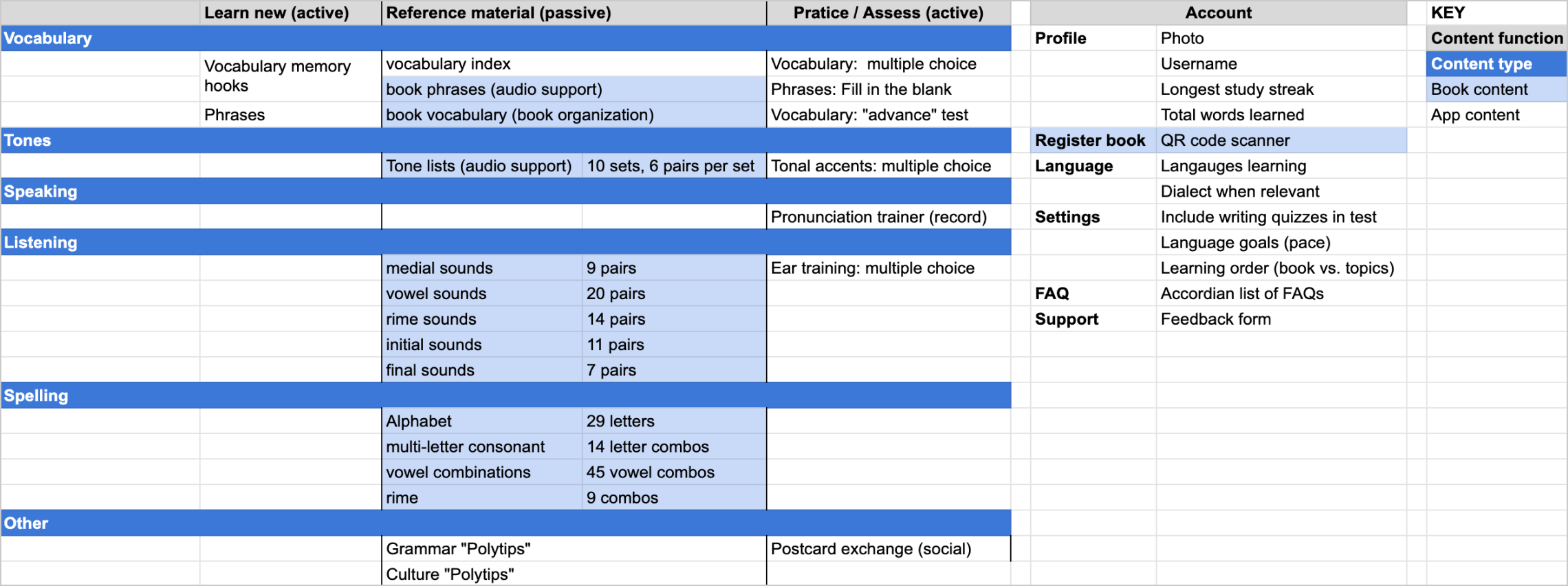
I spent time with the founder to understand how the ideal user would engage each type of content throughout their learning journey.

With this understanding, I was able to group the digital learning experience into two activity buckets (primary and secondary):

PRIMARY: VOCAB
Learn new words
Review words
SECONDARY: SKILLS
Speaking & pronunciation
Listening comprehension
Tonal marks

As a native English speaker who studied Spanish and Portuguese, I had a lot to learn about tonal languages like Vietnamese. You can have 6 different words with the same spelling; the meaning changes based on tone!

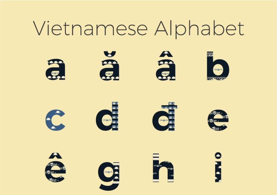
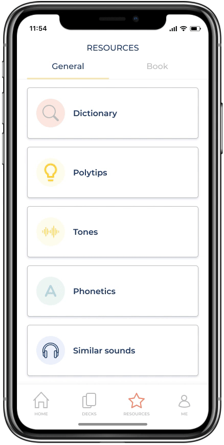
Meanwhile, the book reference materials were mostly a collection of lists (e.g., the Vietnamese alphabet) to let book users hear how the language sounds (audio content).

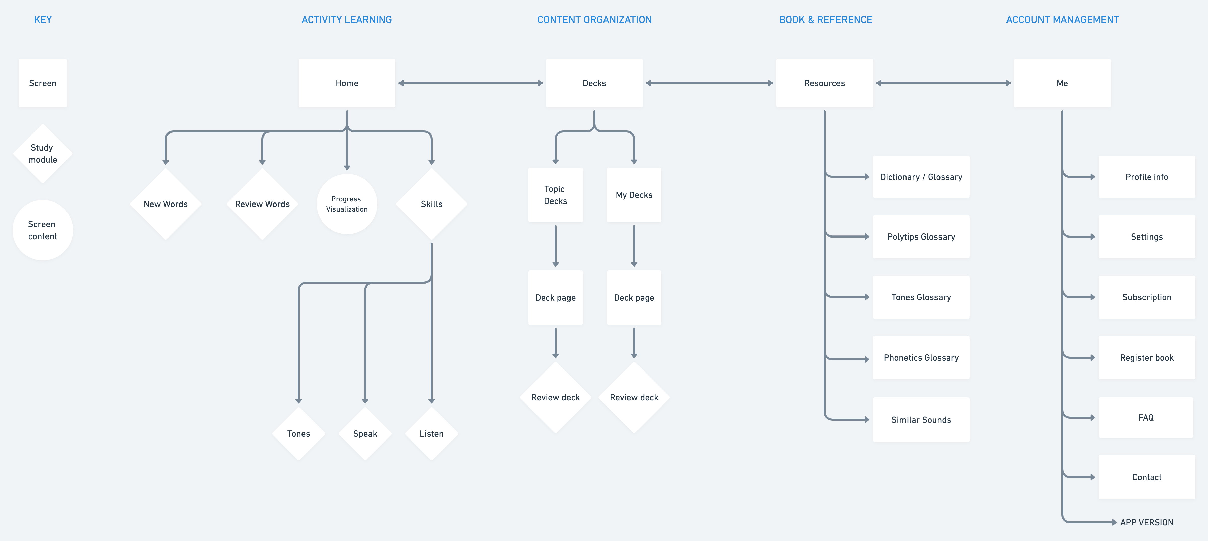
While related, we realized it didn’t necessarily fit in with the digital learning experience. For this reason and to create a direct path for book users I decided that reference materials would get their own, separate “Resources” spot in the app.

Image from the Polyhooks book
INFORMATION ARCHITECTURE

One problem I had to solve was that the word-learning order felt totally random. New words were introduced with the goal of building interesting phrases, so instead of teaching similar words together the program introduced very different words that could be used to compose sentences.

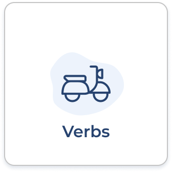
Word order was a non-negotiatiable for the founder, so my solution was to provide an easy way to organize and find words: vocabulary decks. We’d regroup the words into topics that made sense.

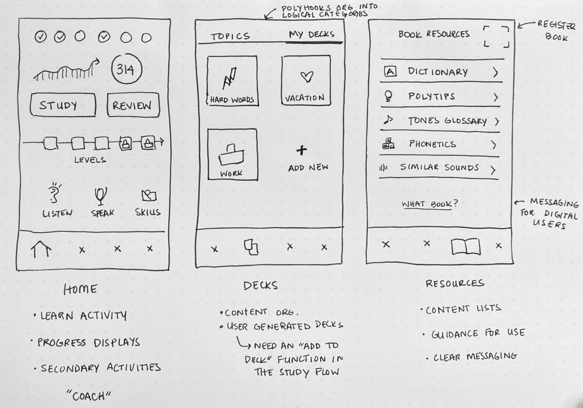
This element was so important, in fact, that I made content organization a main navigation item:

Activity learning (Home)
Content organization (Decks)
Reference materials (Resources)
Account management (Me)

Unless you understood the phrase building aspect, the word learning order made little sense.
Before talking through the proposed information architecture with the team, I drew up a few sketches to anchor our conversation:
The founder had a future product vision to let users to create their own hook stories. Creating a place centered around customization supported this plan.

Screen designs

CORE LEARNING: HOME

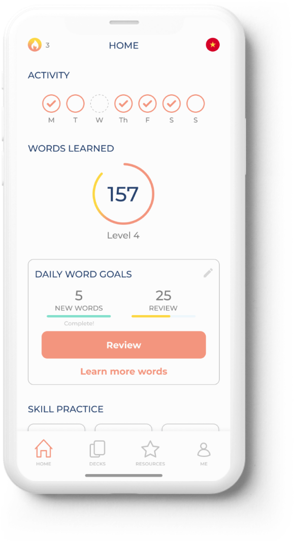
I was feeling good about the app’s organization, but how would users actually engage the Polyhooks learning program?

I started by identifying and breaking down the elements.

STUDY ACTIONS
The two study actions central to the Polyhooks program are Learn new words and Review old words.

In some ways, a single “study” path made a lot of sense.
Duolingo does this; there’s a singular path with a clear next action that feeds into Duo’s one-size-fits-all program.
But this model didn’t really fit our product; Polyhooks is a word memorization strategy, not an incremental language program. While Polyhooks does use a spaced repetition algorithm to recommend the best study pace, we believe that users should be able to study on their own terms.

How could we encourage users to follow our study pacing, while also giving them choice?
What if a user feels like they need more review, or it’s been a few weeks since they last studied?
As seen on the home screen
My solution: the home screen would feature a primary next action button, with the alternative action right below it.

The primary action would be dynamic, guiding users to complete each daily goal.
Users can edit goals directly from the home screen = customizable learning.
MEASURING SUCCESS

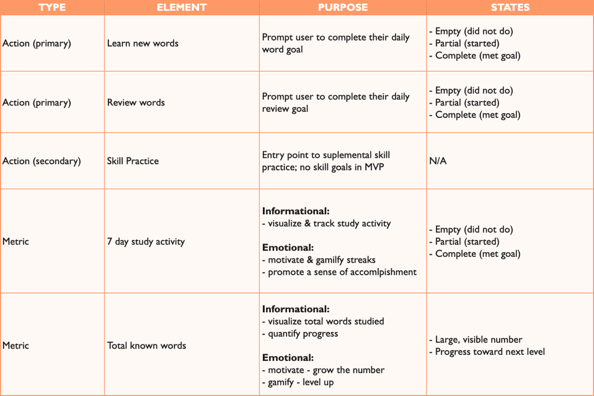
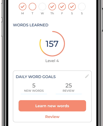
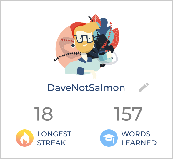
Success in the Polyhooks program  looks like two things:

1.  Studying every day
2.  Growing your vocabulary


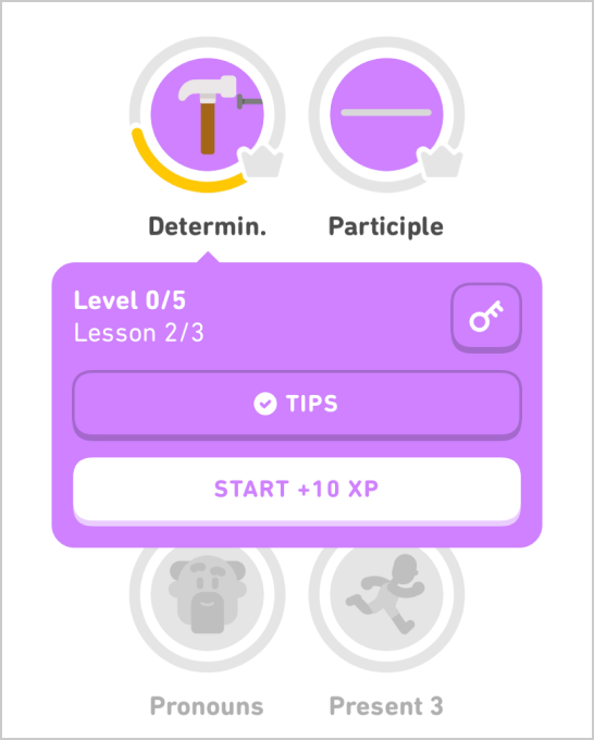
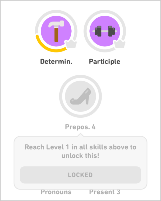
The founder had a lot of ideas around implementing a “study coach” character who would monitor and encourage user progress. I loved the idea, but our time constraints made this feature an unrealistic pursuit.

Knowing that our future plans included a robust vision for progress monitoring, I opted to keep progress visualization simple.

Success metrics featured on user profile
Home screen
HOW CAN YOU TELL IT'S WORKING?
This was the question I kept asking. Not surprisingly, it was the question users struggled to answer most in interviews. And for good reason! As someone living abroad, I know: language acquisition is not a linear process.

In user interviews most people described emotional measures of success.

Due to time constraints we had to deprioritize this meaty question. I’m looking forward to exploring confidence-based self-assessment and how learners perceive and recognize their own language development in the future.
An idea for emotionally measuring success
CONTENT ORGANIZATION: DECKS

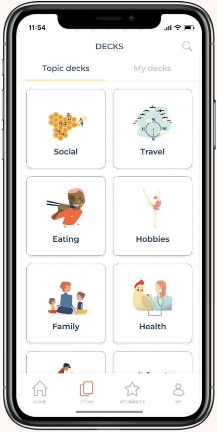
Decks were all about giving users different ways to organize their vocabulary. I decided on a simple tabbing system to separate Polyhooks-generated topic decks and user-generated decks.

In line with early branding work, I used the illustrations from the book as ambassadors of the app’s personality and warmth.

The true power of decks would be the ability for users to target their own studying. Imagine reviewing the "Eating" deck right before dining at a restaurant.

It was important to track progress at the deck level. A future goal is to display individual deck progress on the decks screen so that users can see where they stand without tapping into each deck.
REFERENCE MATERIALS: RESOURCES
It was time to design our little resource corner. I kept thinking about it like the reference section of the library. This tab was basically an index of lists; content pulled directly from the book, plus audio.

To be honest, this was a moment I worried about user confusion. Some content was actually useful to the digital experience, while certain materials would only make sense if you’d purchased the book.

Book users needed a clear path to see their stuff, and digital users needed clear messaging to know why some content wasn’t for them.

To solve this issue, I repeated the Decks tabbing pattern.  The “General” resources tab had reference materials for everyone, while book users could tab over for book-specific content.
I couldn't help imagining the Book tab as the Restricted Section of the library ⚡️

Results & next steps

USABILITY TESTING

Usability testing was largely successful! Users were able to navigate the app with little to no errors. I believe that clear copy and simple info architecture played a large role in the app’s usability success.

That being said, usability tests can only reveal usability issues. I’d like to conduct in-person testing to gather qualitative insights.

I’d also like to set up event tracking to analyze user actions. How often do digital users engage the Resources tab? How do book users engage the app? How can we optimize both users’ experiences?

I really love the overall design and wish there was something more like this for Japanese, which is the language I'm currently learning.
NEXT STEPS
01
ONBOARDING
  • “What’s a memory hook?” was the most common quote in testing.
  • Non-book users are downloading yet another language app. Many will bring assumptions and expectations.
02
CONNECTEDNESS
  • Right now the app is pretty siloed. How might we draw useful connections between sections?
  • Is there a “study deck” action that belongs on the home screen?
03
GAMIFICATION
  • How might we show users their learning gains and motivate them to study daily? How might we give users a sense of accomplishment?
See the prototype >>